Commercial retailer · E-commerce
Helping customers find the right replacement from an old product.
I redesigned a commercial retailer’s website and mobile experience around a practical customer problem: identifying an old product and buying the correct replacement.
- Engagement
- Consultant through Full Fat Things
- Role
- Product design and frontend
- Team
- 1 designer, 1 mobile developer, 2 web developers
- Duration
- Two months
The problem
Customers often knew what they owned, but not what to search for.
The retailer’s brand and digital experience had not changed for years. A visual refresh was required, but the more useful opportunity was to reduce the effort between an old product in a customer’s hand and a suitable replacement.
That journey had to work across desktop, mobile web and a native app, while meeting precise expectations for how quickly someone could purchase or reach support.
What needed attention
Connect identification, confidence and purchase in one short journey.
-
Customers did not always know the product language
They might have old packaging, but not the name or specification needed to search a specialist catalogue.
-
The journey covered three platforms
Product discovery, buying and support had to remain coherent across desktop, mobile browser and mobile application.
-
The route to purchase needed to remain short
The client had precise click-count expectations for reaching a purchase or contacting support.
The inherited experience
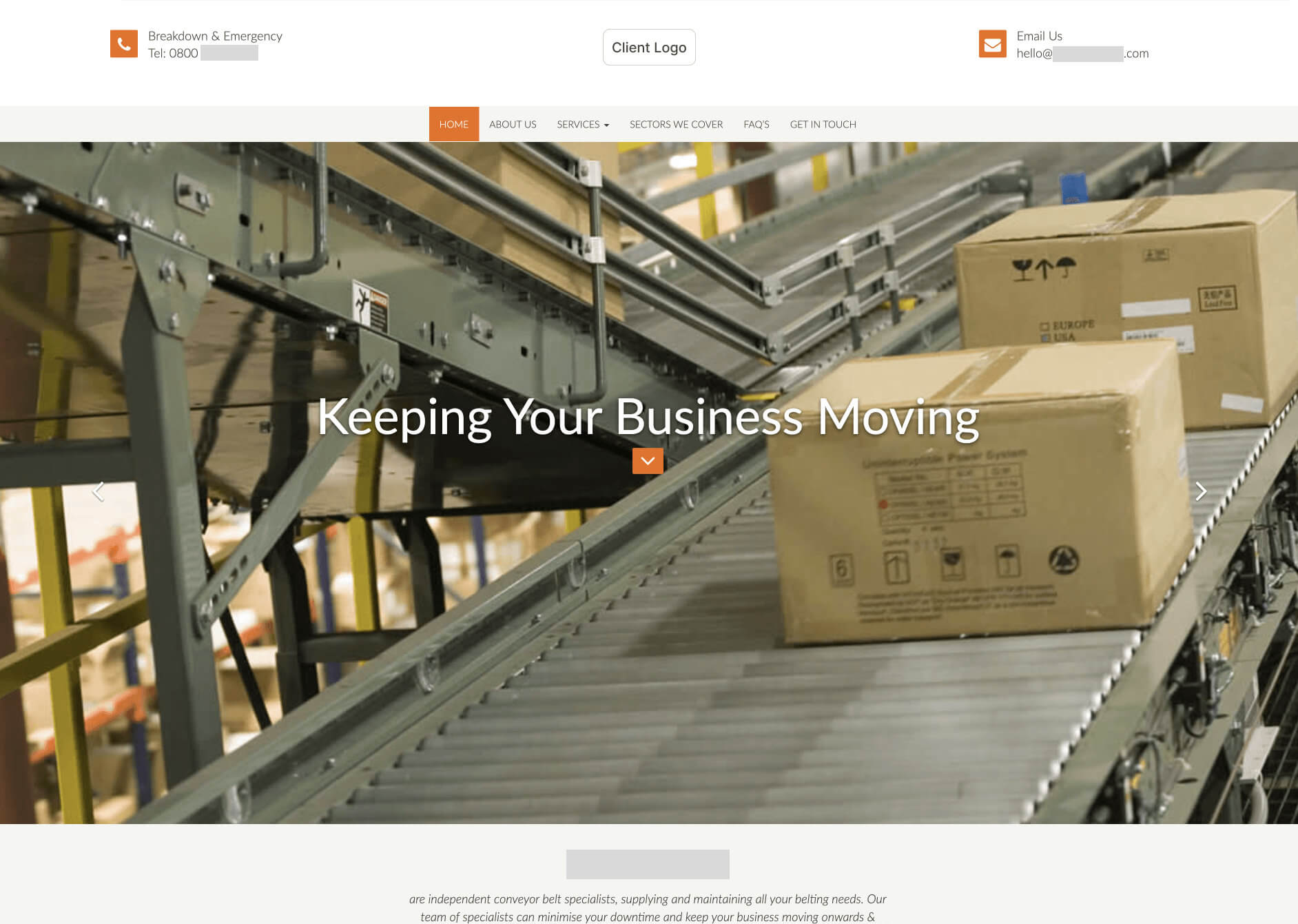
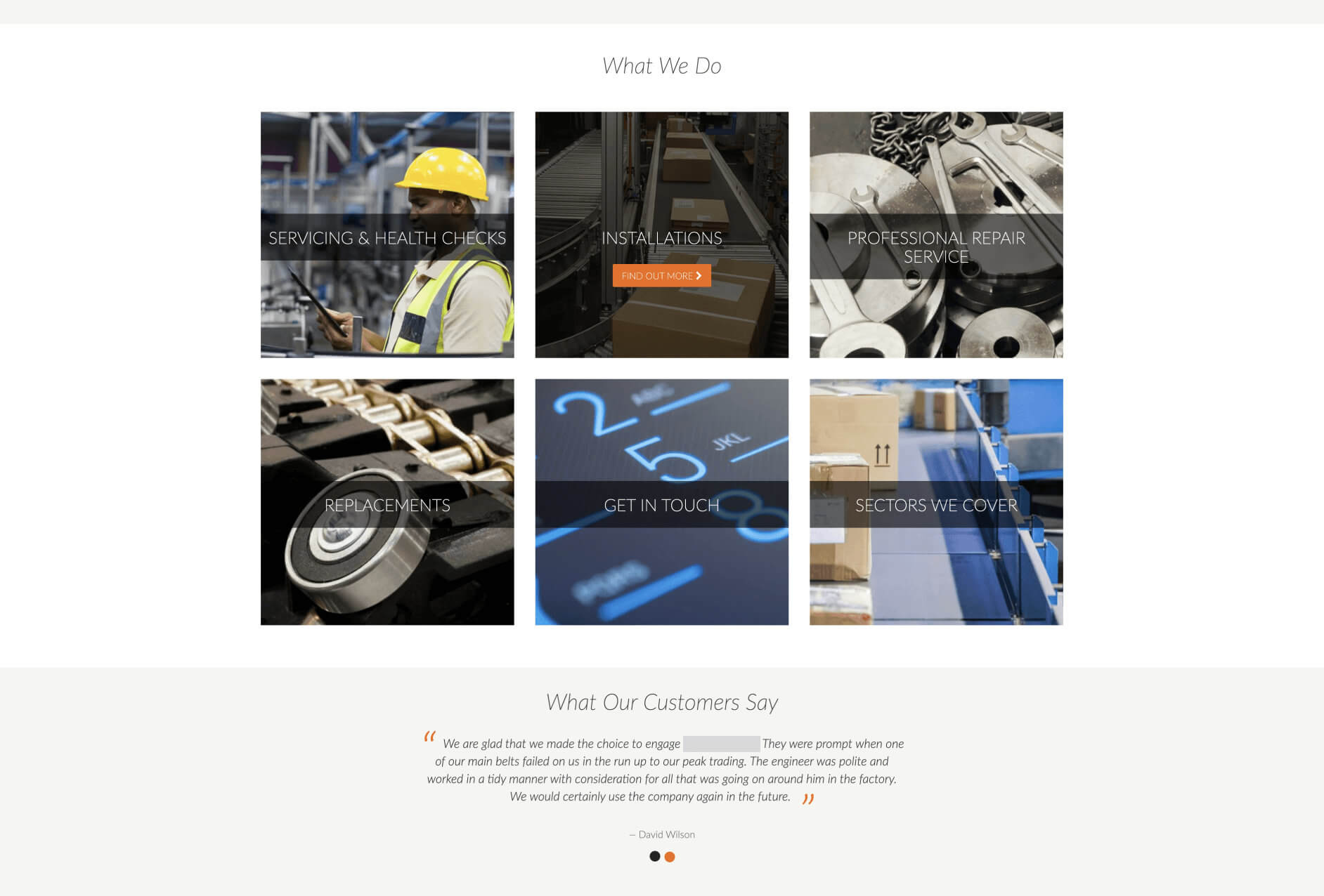
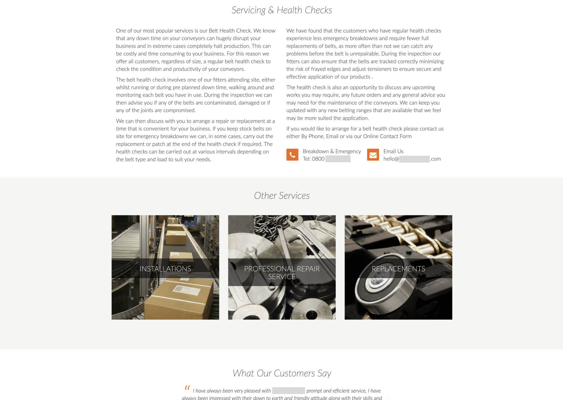
A dated interface reflected the catalogue not the customer’s task.
Finding the useful problem
Understanding the customer’s uncertainty
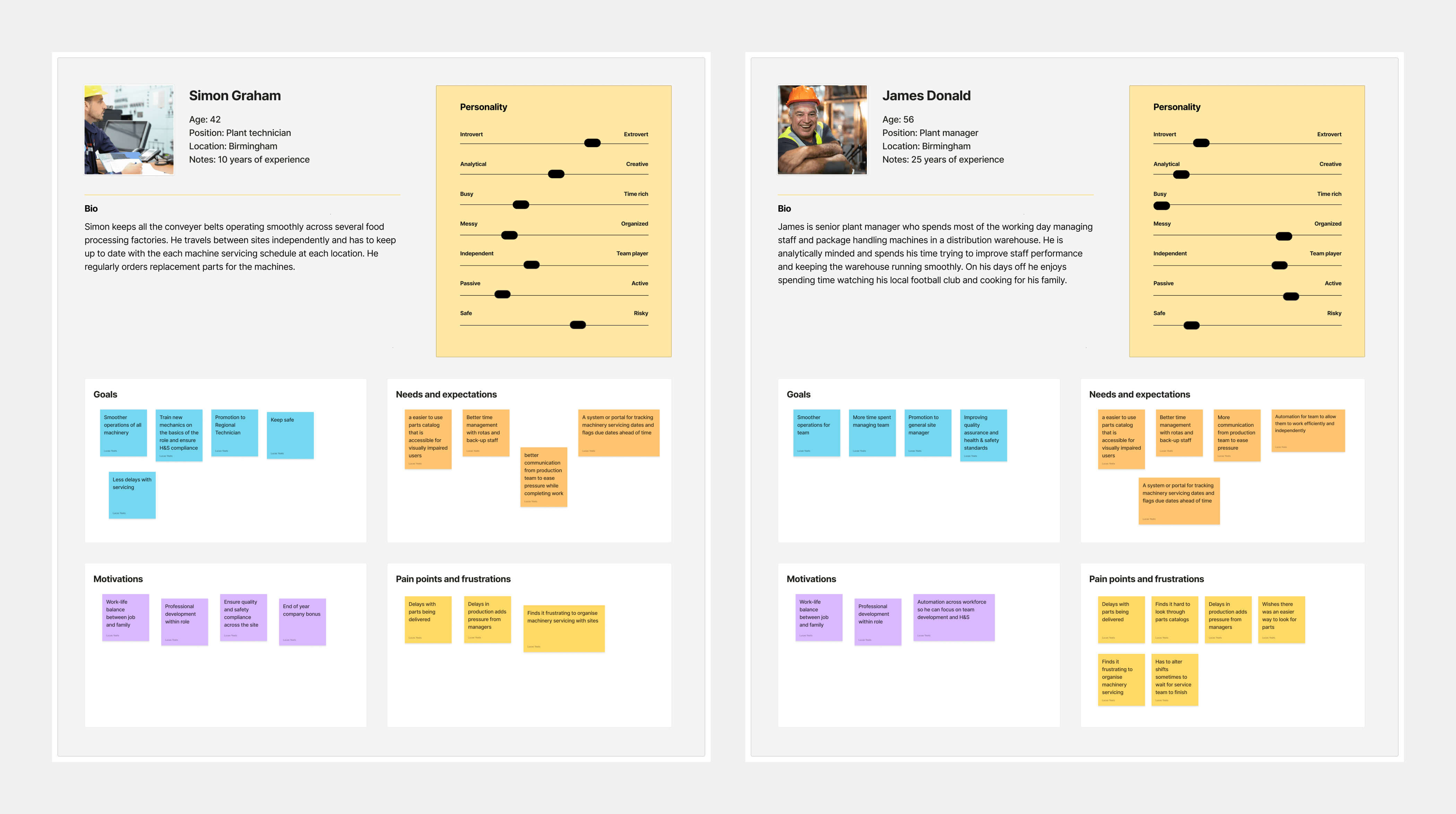
I led remote requirement sessions with the client, reviewed the existing journey and compared competitor experiences. Personas helped the team focus on customers who needed reassurance and guidance rather than simply a faster product grid.
Direct in-person research was limited by Covid restrictions, so I kept the early structure visible and reviewable through regular calls with stakeholders and engineering.
Using the packaging to identify the product
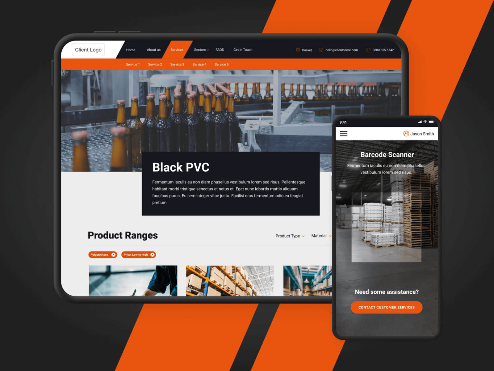
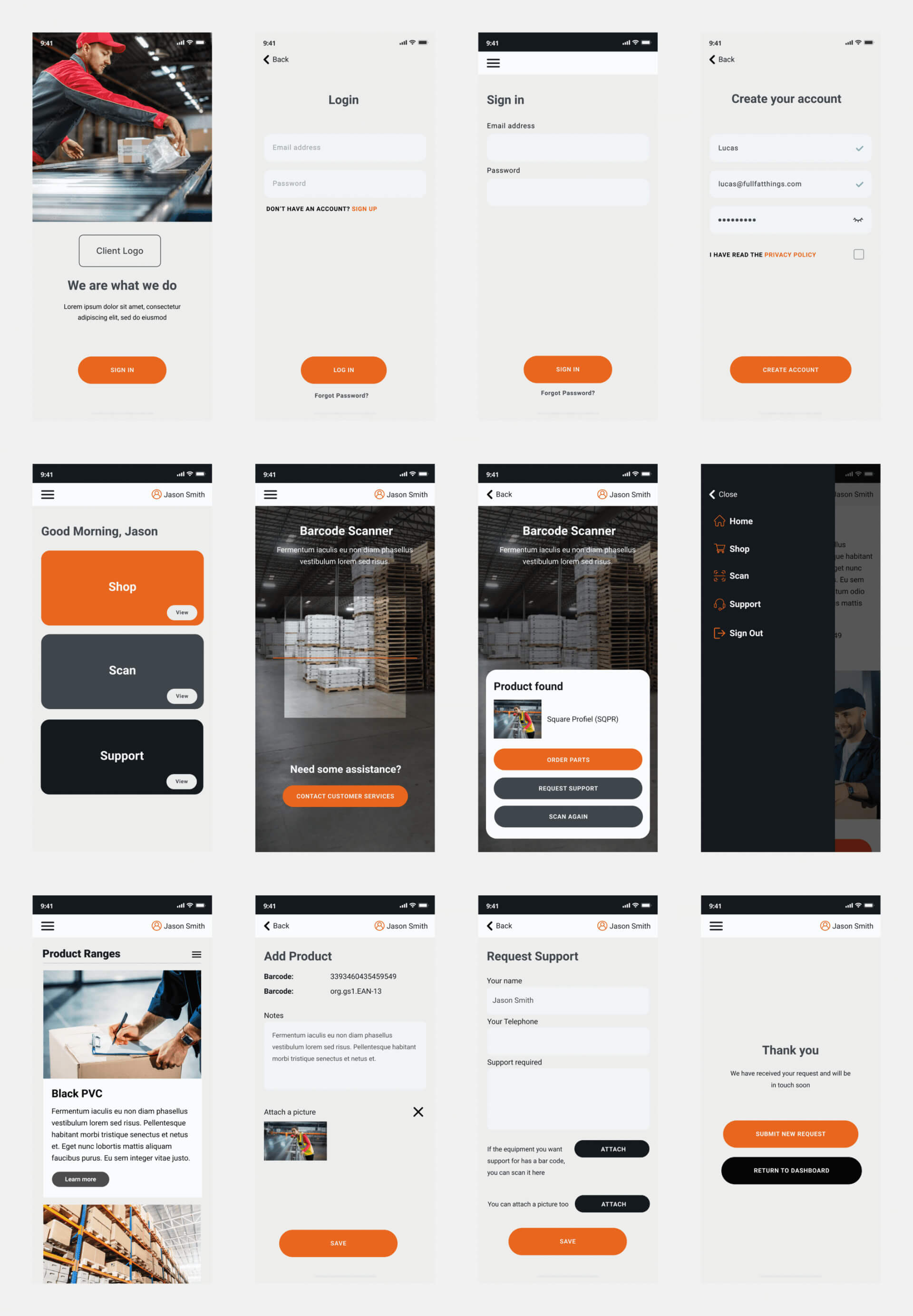
The mobile app used barcode scanning to remove the need for specialist product knowledge. A customer could scan old packaging and move directly to a suitable replacement.
The flow then had to establish confidence: show why the replacement matched, make alternatives understandable and keep support close when a definitive match was not possible.
Instead of asking customers to translate a physical product into catalogue language, the product did that work for them.
Keeping the journey consistent across each channel
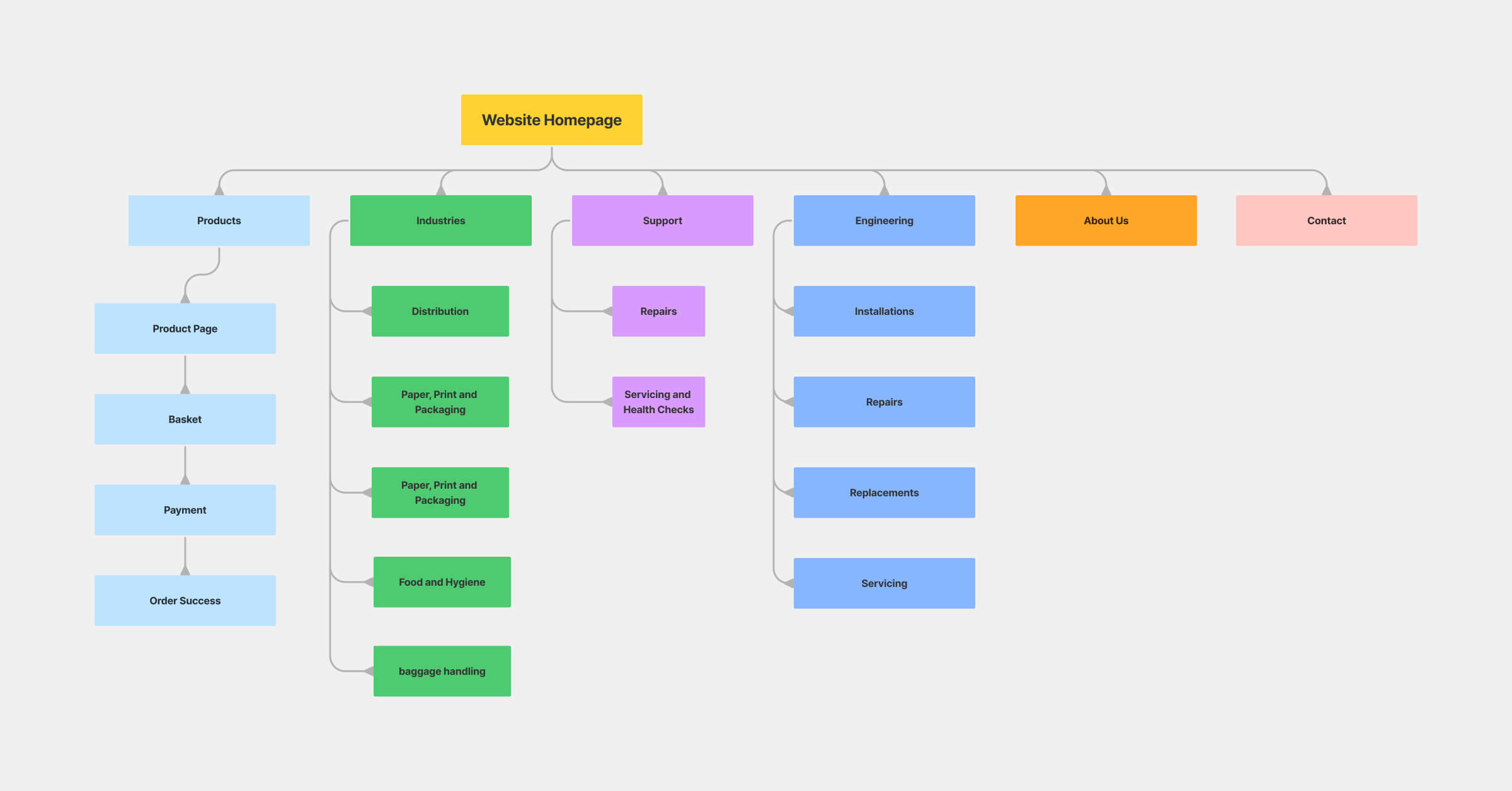
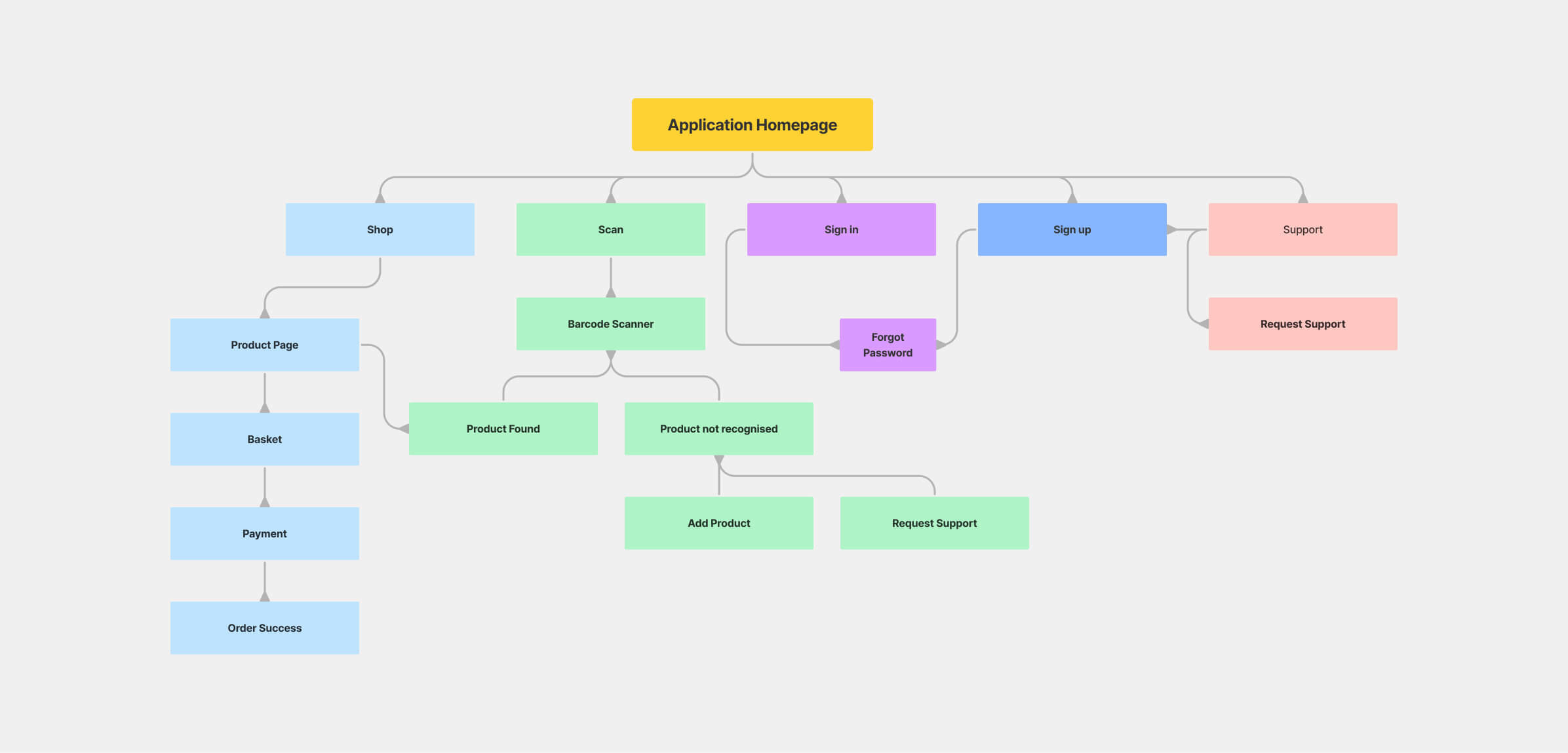
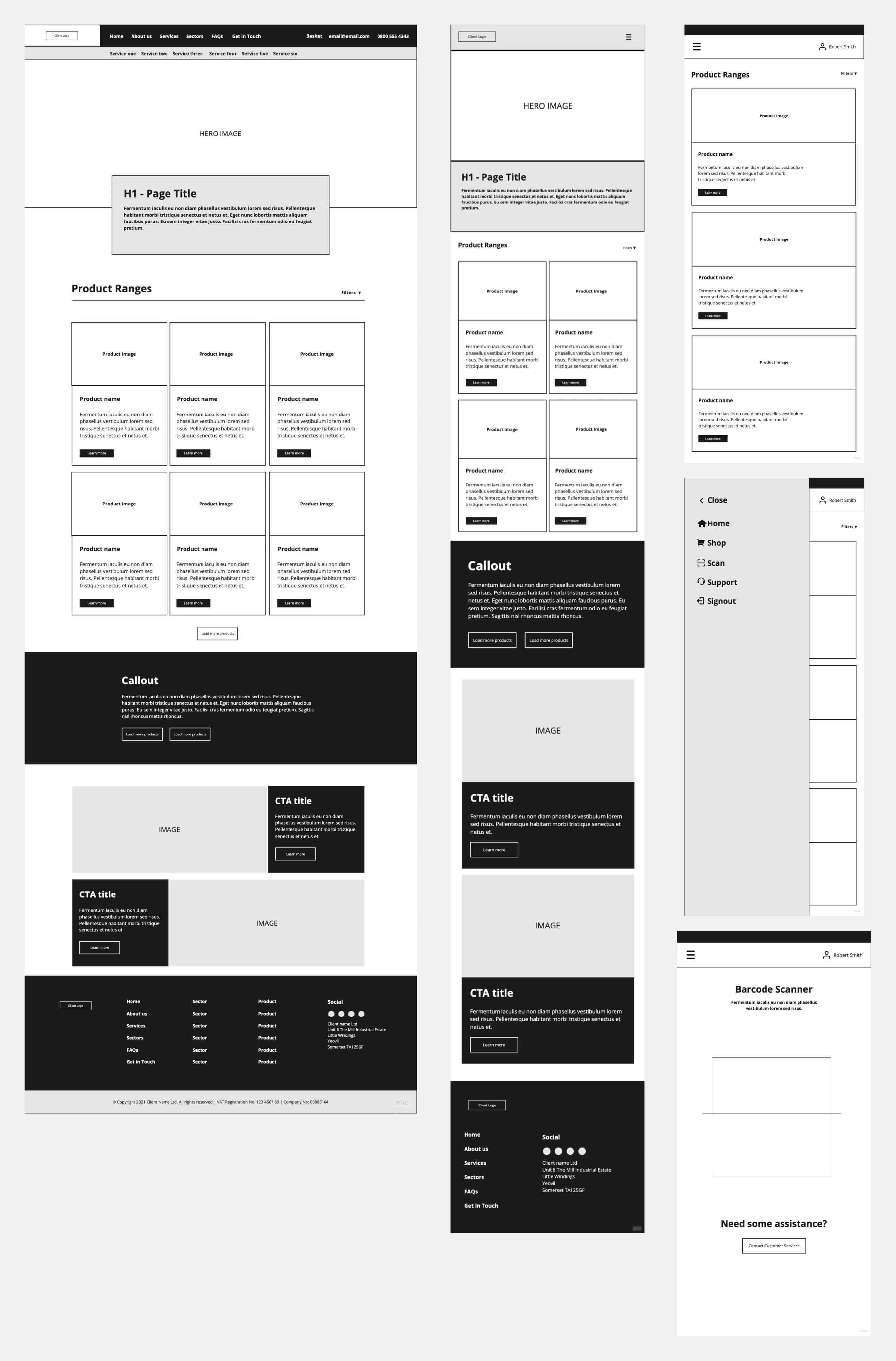
I mapped web and app structures together so search, product comparison, purchase and support used the same mental model. Channel-specific capabilities such as barcode scanning improved the journey without creating a separate product logic.
Creating one visual system for web and mobile
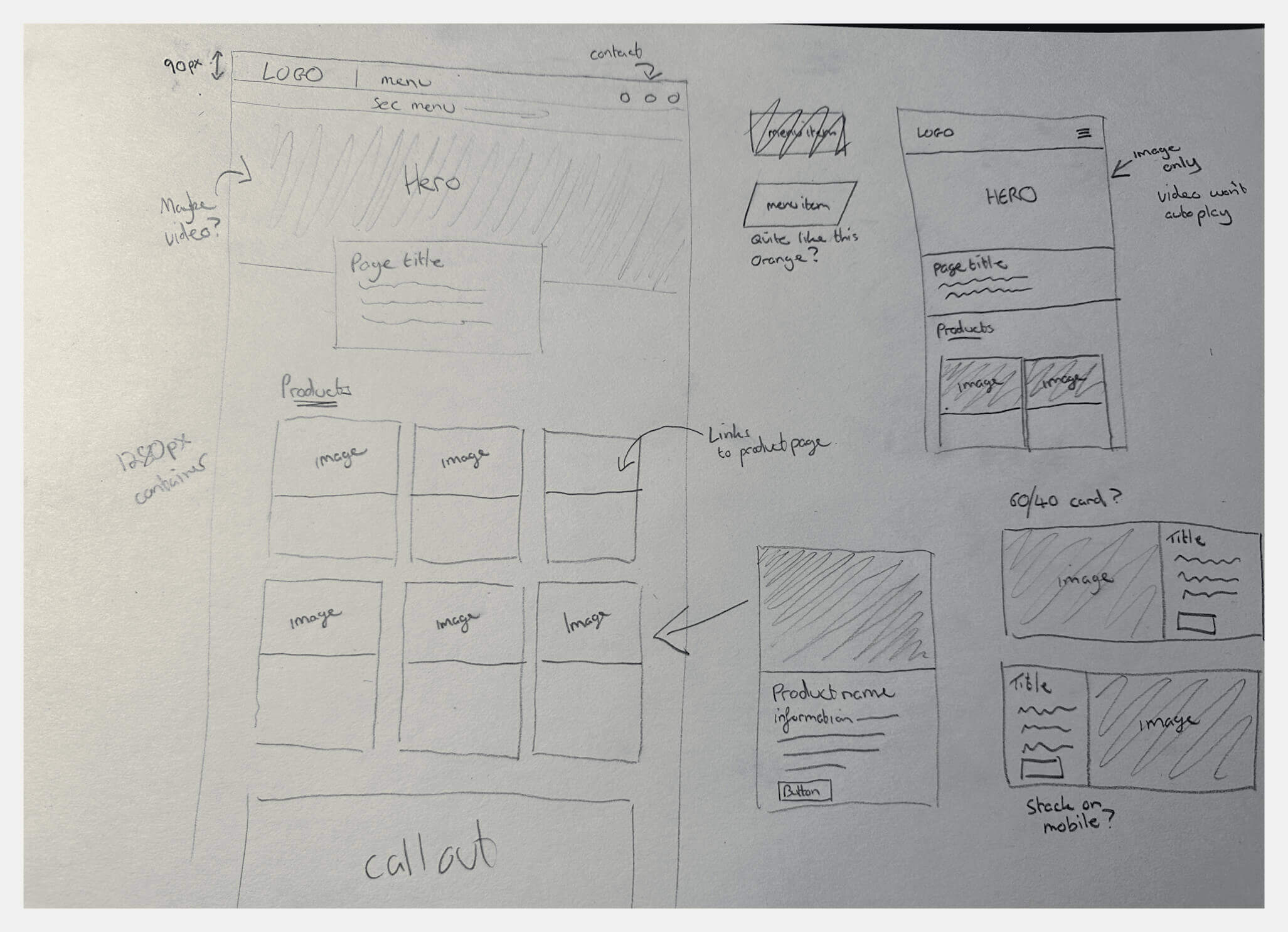
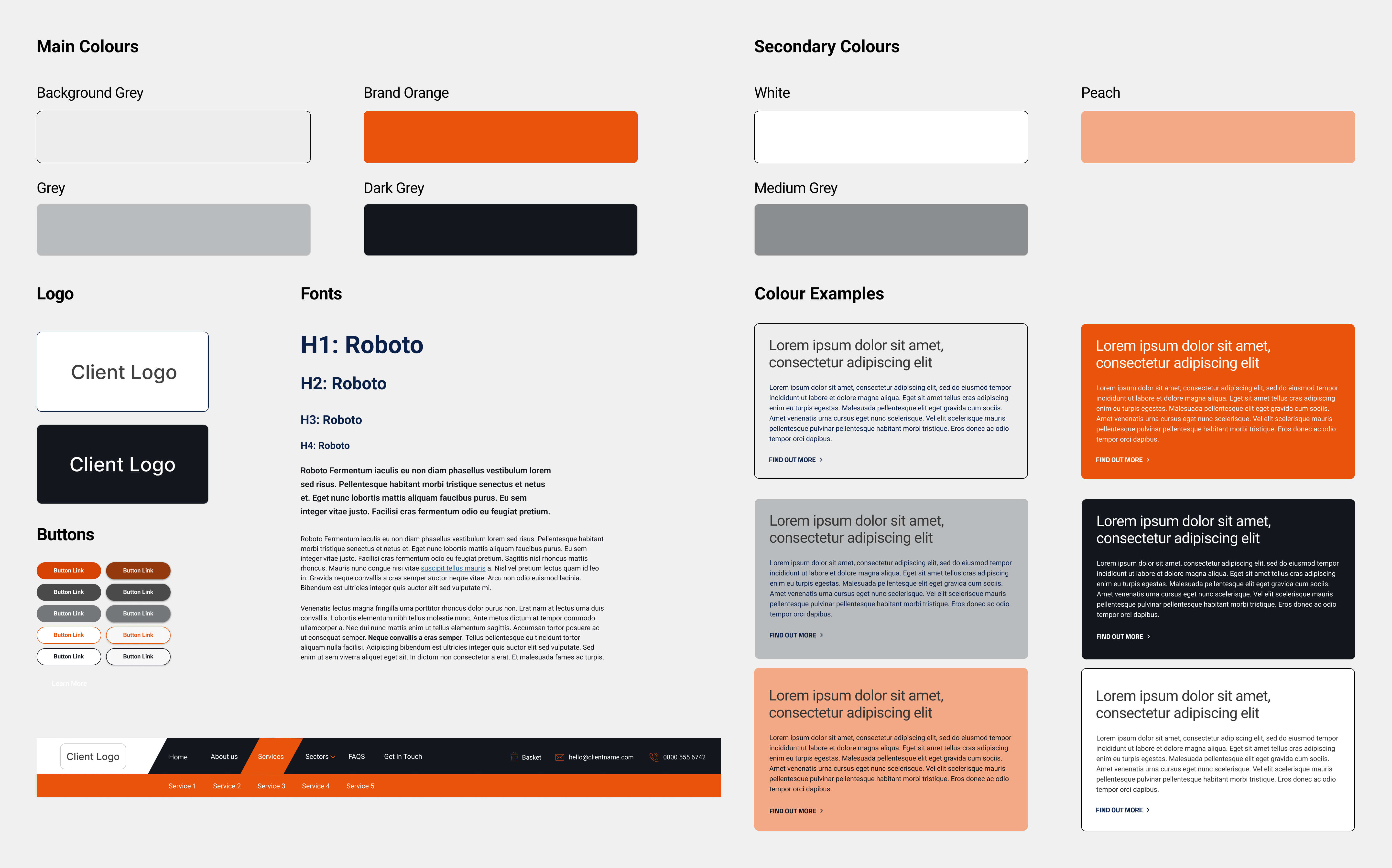
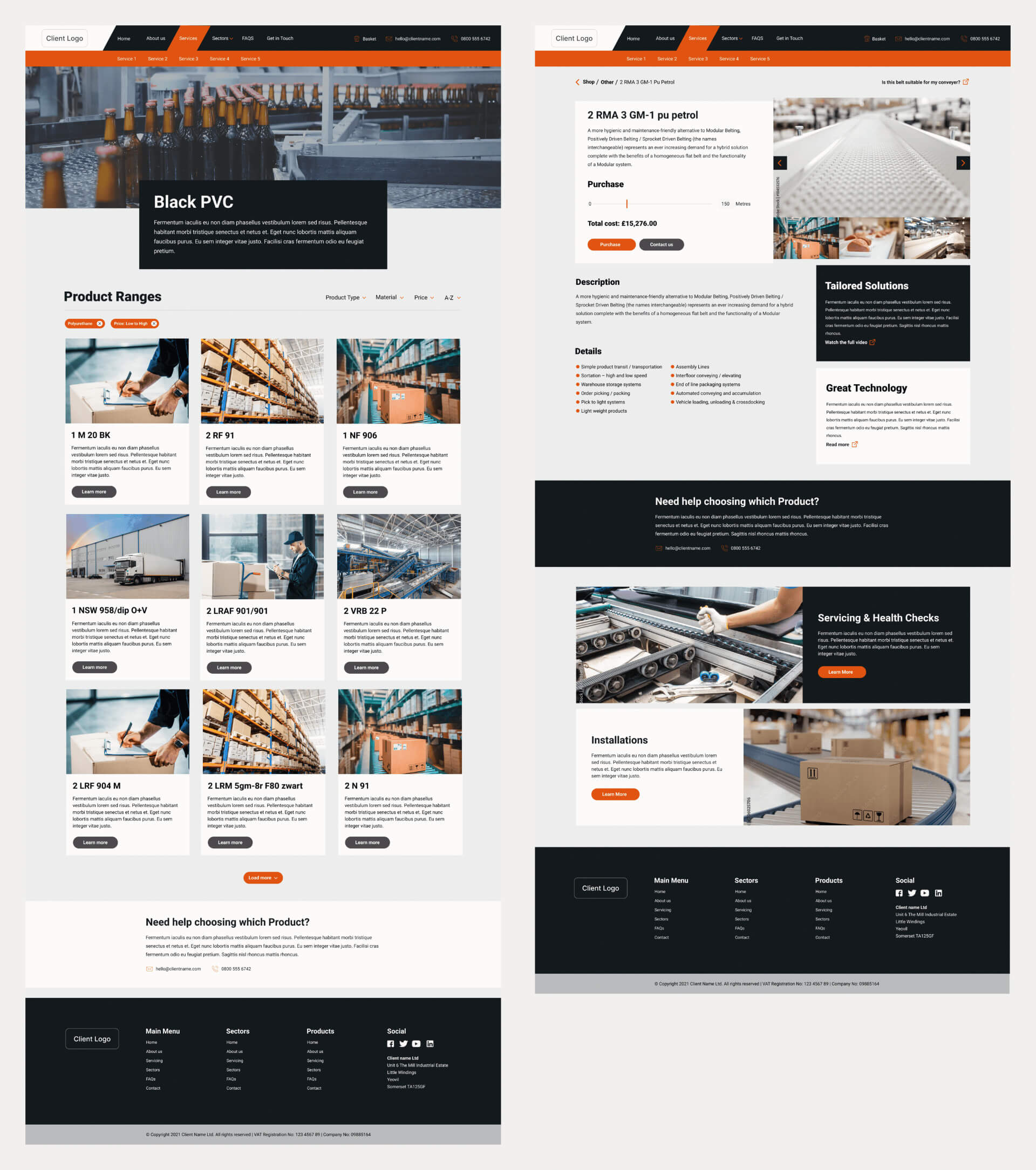
I developed shared blocks, layouts and interface states for desktop, mobile web and the app, replacing years of accumulated inconsistency with one responsive system.
Feasibility was reviewed continuously with the mobile and web developers. After sign-off, I also supplied HTML and CSS reference files to reduce ambiguity during implementation.
Delivery
Completing the replacement journey
The outcome
A modern commerce system organised around replacement, not browsing.
In two months, the engagement produced an agreed cross-channel structure, new visual system, desktop and app prototypes, and front-end reference files for delivery.
The strongest part of the concept was not the visual refresh. It was the direct route from the product a customer already owned to a replacement they could understand and buy.