Pumpchecker · Engineering platform
Helping engineers find wells that need attention before performance deteriorates.
I redesigned a specialist oil-production monitoring platform so engineers could move through thousands of wells, spot problems and investigate the production data behind them from one workspace.
- Client
- Alperform
- Role
- Product design and frontend
- Team
- 1 designer, 1 product manager, 4 developers
- Duration
- Three months
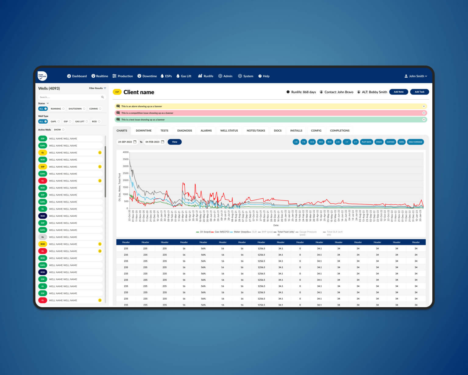
The problem
The platform held valuable information, but it was difficult to move through.
Pumpchecker contained the data that managers and engineers used to monitor production and diagnose faults. Over time, the interface had become crowded and inconsistent. Important information was still there, but users had to work harder than necessary to find it and understand what needed attention.
The existing colours, terminology and filter locations were familiar to experienced customers. I needed to improve the structure without removing the parts of the product they already understood.
What needed attention
Make the signal easier to find, without flattening the detail.
-
Scanning a large number of wells
Engineers needed to move through large numbers of wells and understand status quickly, without opening every record.
-
Making space for specialist filters
The well list needed many specialist filters in a restricted space. Hiding too much would make the tool less useful.
-
Working within the technical foundations
Every interaction and component had to work with Bootstrap 5 and the development team’s chosen data-visualisation tools.
Getting to the real requirements
I had to understand the work before changing the interface.
Oil production was an unfamiliar domain, so I began by learning the language, the day-to-day decisions and the reasons behind the legacy product.
I ran workshops with the product manager, senior stakeholders and development team, then went directly to customers with questionnaires. That helped separate genuine user needs from internal assumptions.
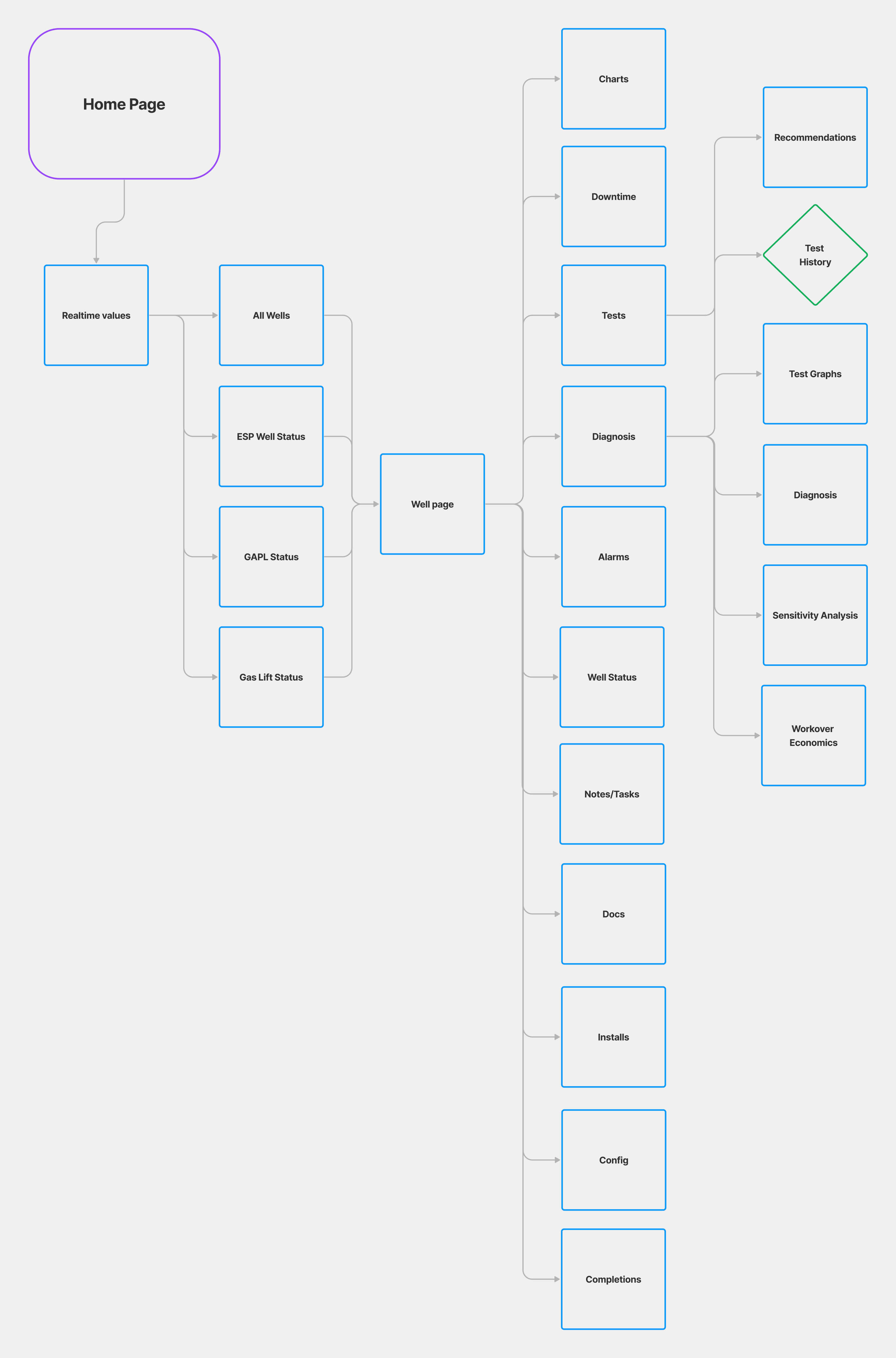
I mapped the existing sitemap, technical screens and key journeys to see where users were losing context and where familiarity still mattered.
Keeping the parts users already understood
Customers were highly familiar with the old application. A dramatic visual reinvention would have increased the learning burden and risked hiding the tools they used every day.
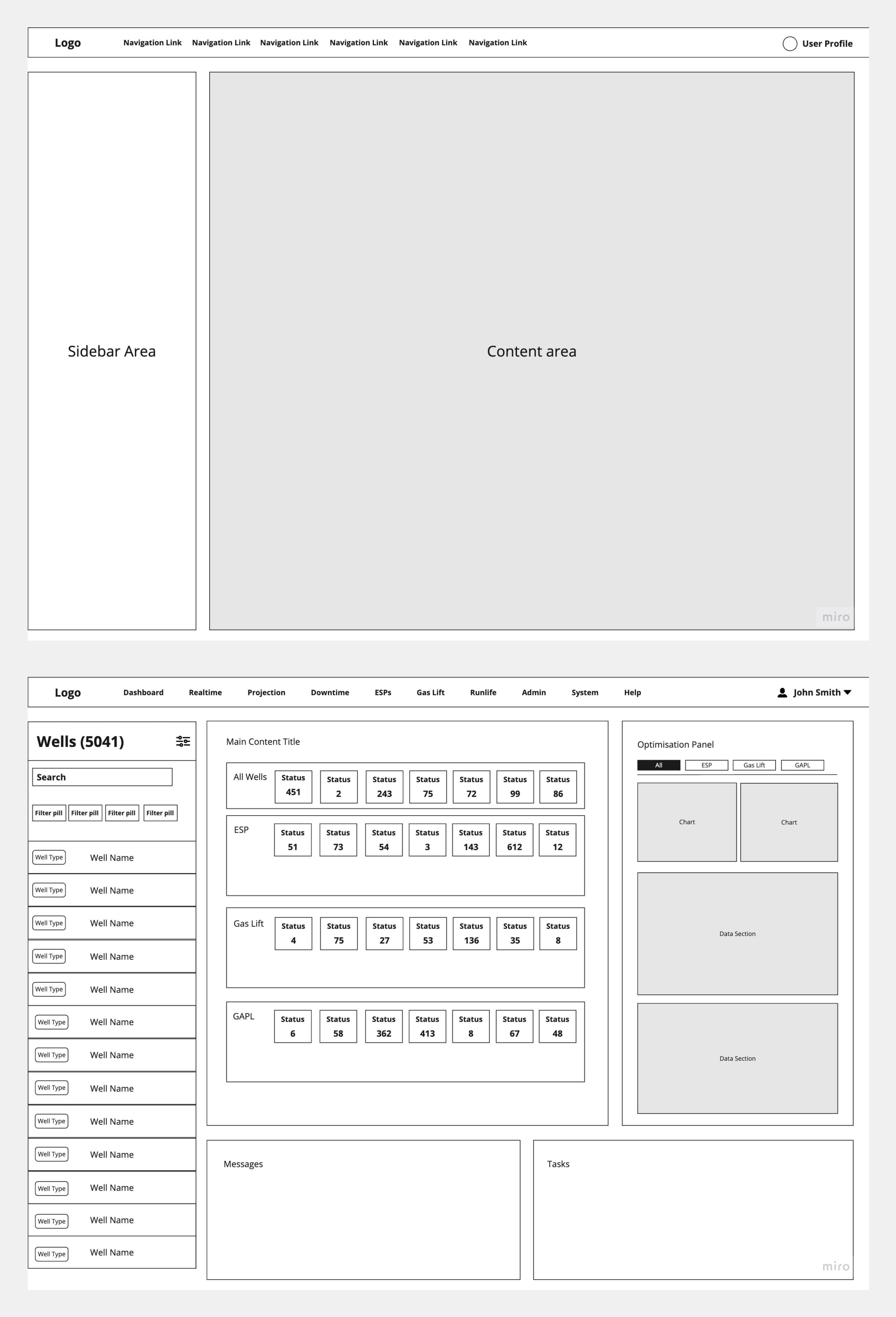
I retained familiar status colours and the location of key filters, while introducing a consistent global sidebar and a clearer hierarchy across the workspace.
The aim was not novelty. It was a faster route from “something looks wrong” to the data needed to investigate it.
Giving the well list more structure
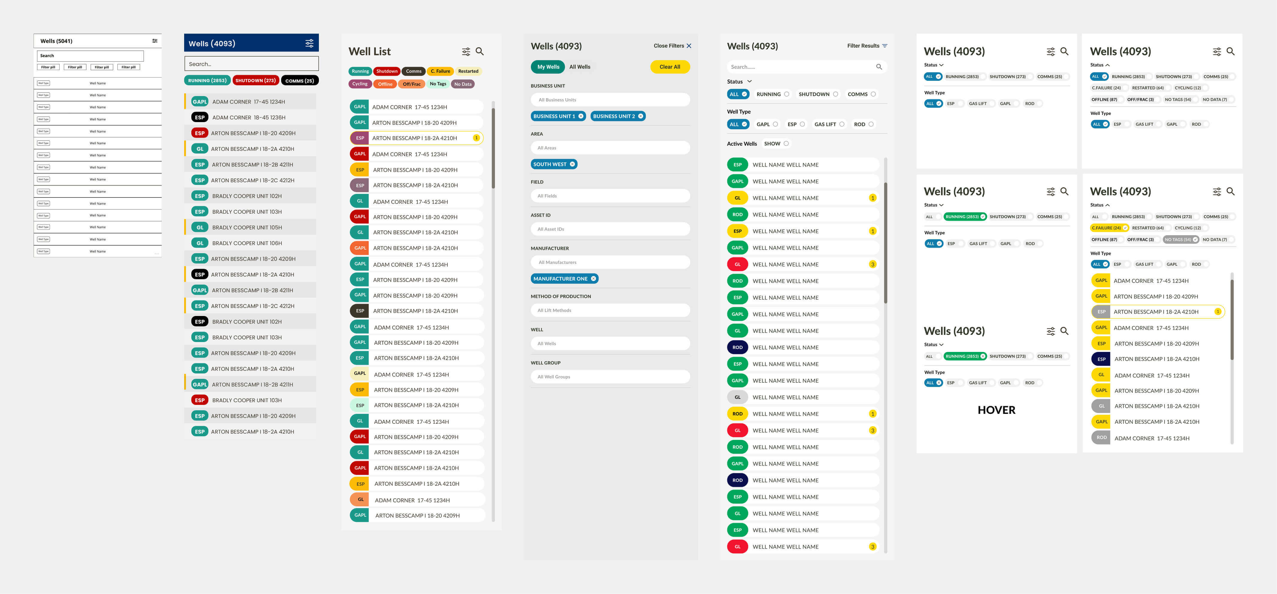
I used collapsible filter groups to keep common controls visible while moving less frequent choices out of the way. Larger options opened in focused popovers rather than permanently consuming sidebar space.
Status remained visible in the list, giving engineers a quick way to narrow a large estate and decide where to investigate next.
Creating a system the team could continue using
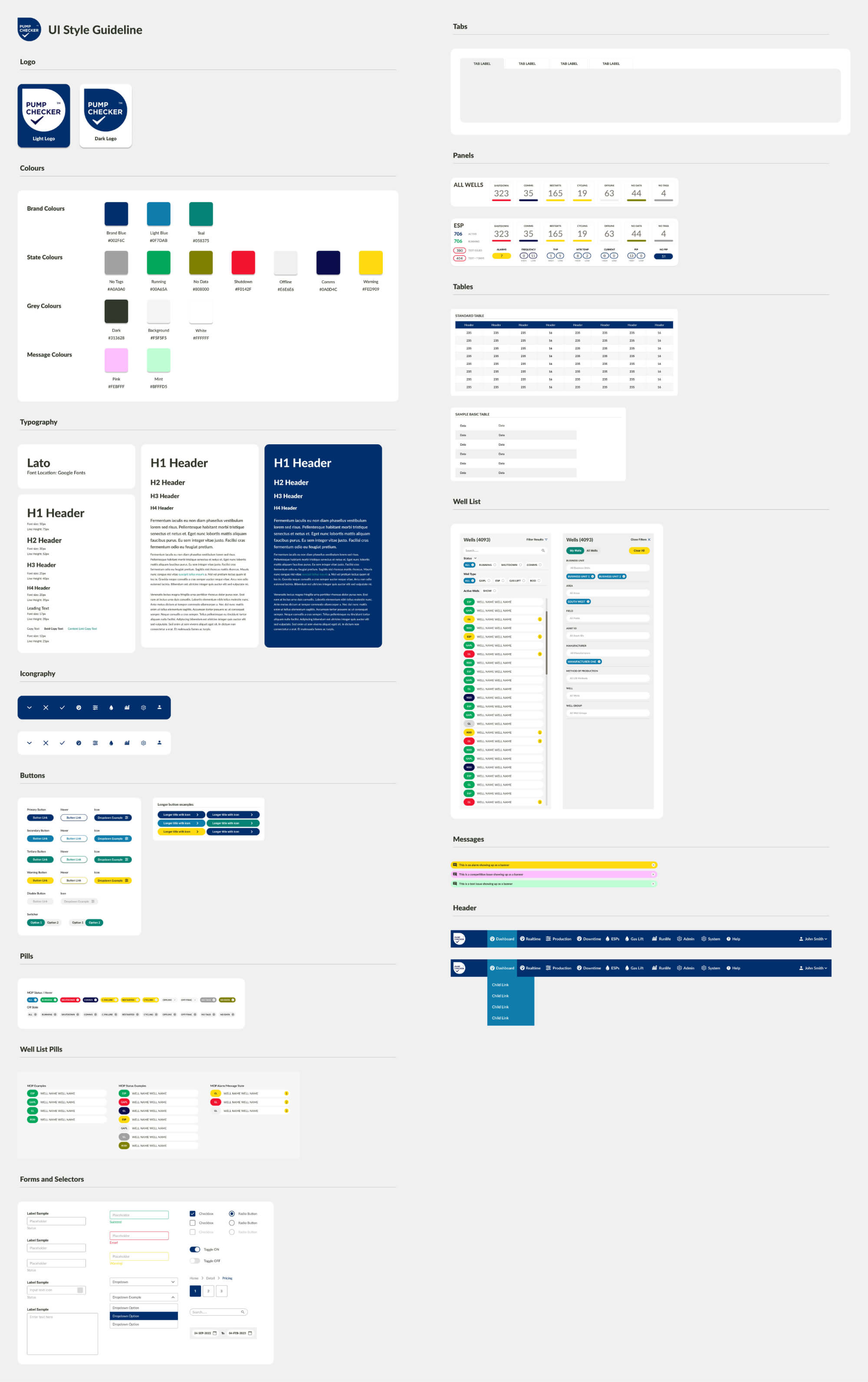
The legacy product’s inconsistency could not be solved screen by screen. I created a reusable design system covering panels, tables, forms, actions and the patterns used throughout the technical dashboards.
Components were designed around Bootstrap 5 and the existing visualisation framework. I then produced static HTML, CSS and Bootstrap files, reducing interpretation between the signed-off designs and implementation.
Delivery
Keeping design and development moving together
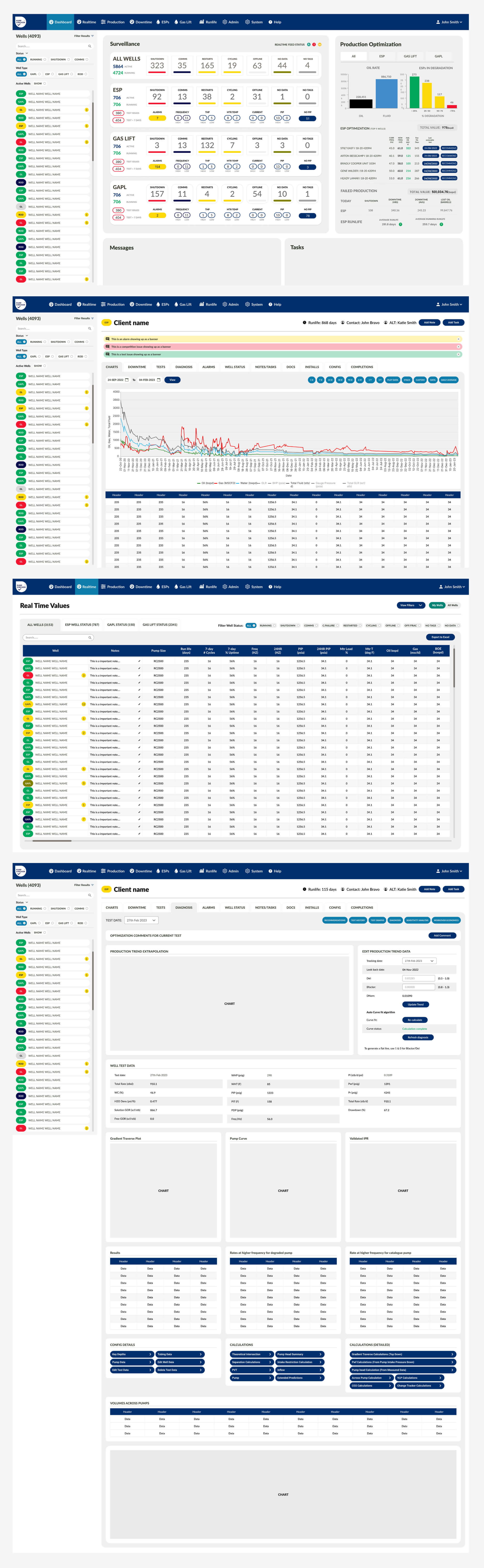
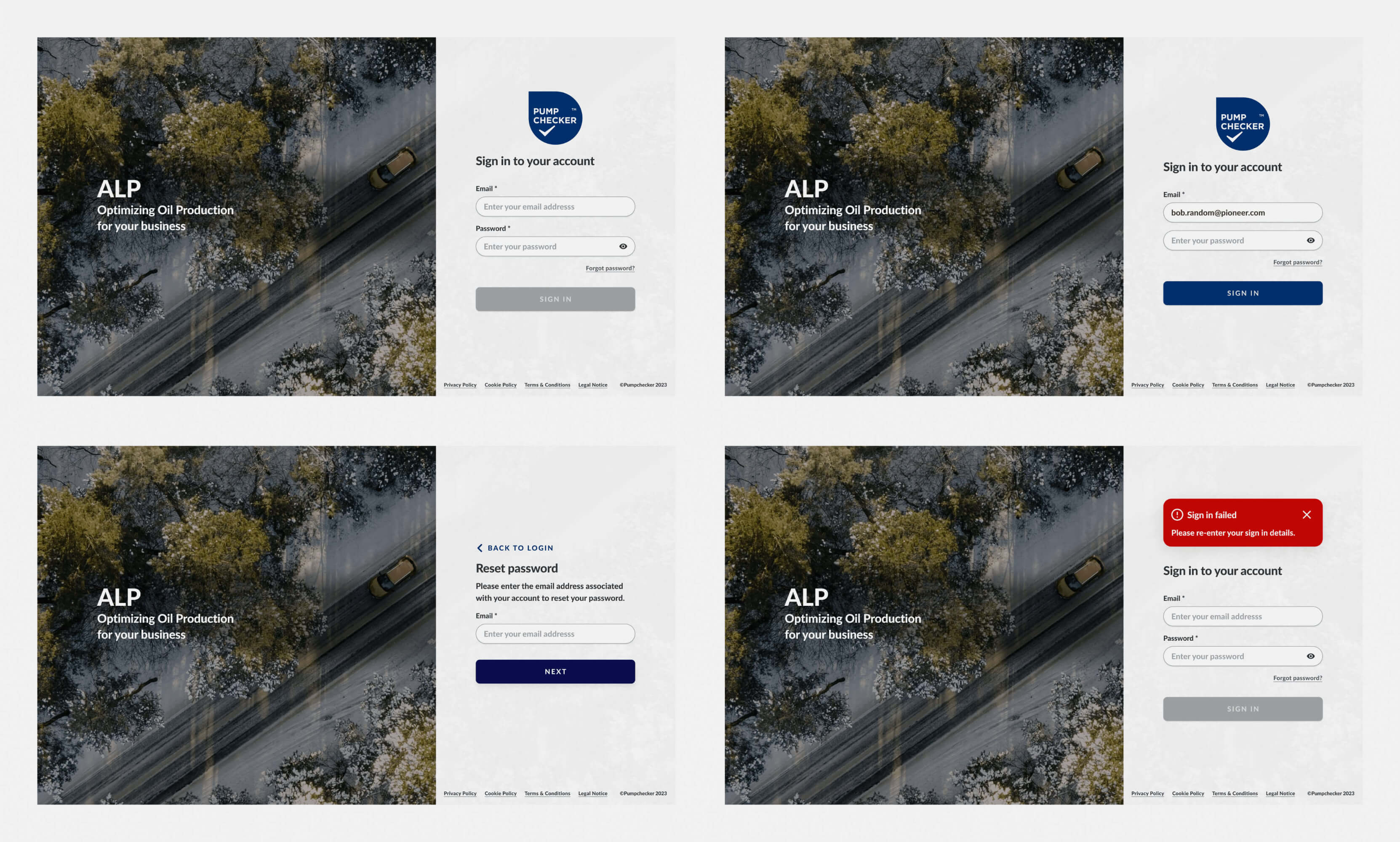
Once the core system and wireframes were agreed, I built high-fidelity Figma prototypes for the most urgent pages. That allowed development to begin while I continued resolving secondary workflows.
The outcome
A clearer route through a complicated operational system.
In three months, the project moved from a fragmented legacy interface to a signed-off, buildable product direction: a global way to navigate and filter wells, a clearer investigation workspace and a reusable visual system for the wider application.
The work preserved the knowledge experienced users had built up, while making the product more coherent for the people using and developing it next.