Lloyd’s Register · Enterprise platform
Helping managers see which incidents needed attention first.
I designed a new operational dashboard and shared visual system for a suite used by large retail, restaurant and hospitality organisations.
- Client
- Lloyd’s Register
- Role
- Product designer
- Team
- 1 designer, 1 product manager, 7 developers
- Duration
- Four months
The problem
Managers could see a large amount of information, but the priorities were not always clear.
Following a company merger, Lloyd’s Register needed to rebrand a suite of software and add a new product for retail customers. Users moved between multiple dashboards, services and levels of access.
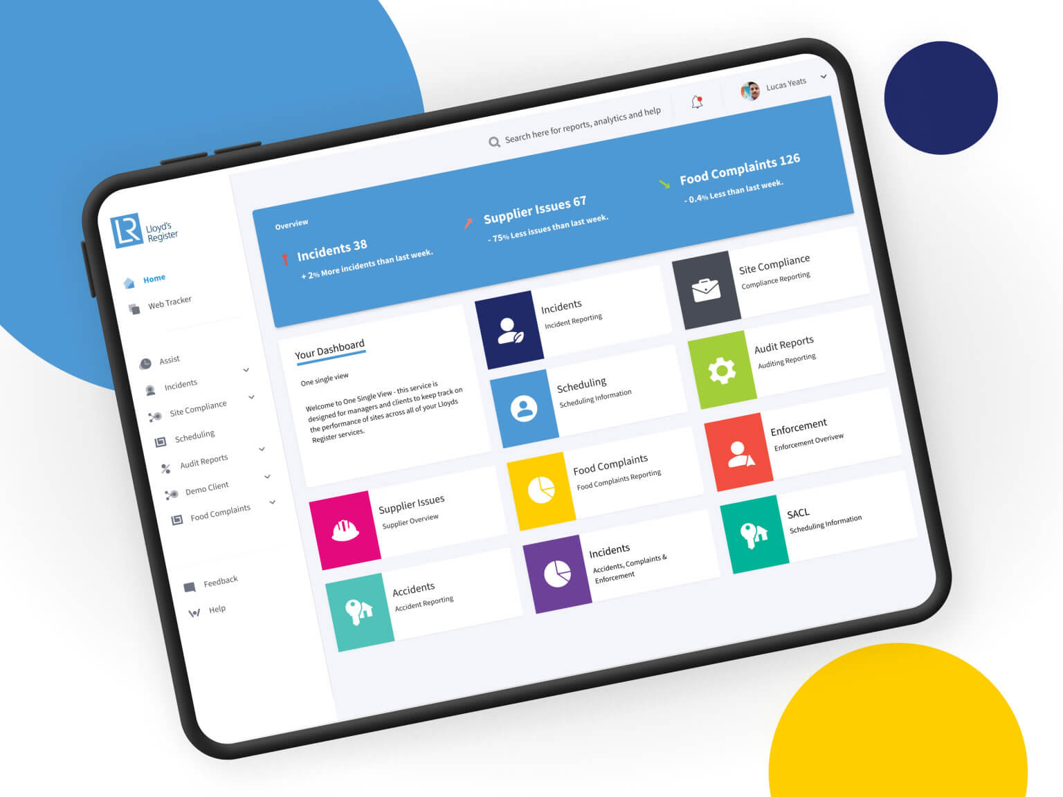
The new home screen had to surface incidents, compliance issues and key metrics immediately then give each person a clear route into the detail they were authorised to see.
What needed attention
Turn a broad software suite into one clear starting point.
-
Making urgent information visible
Immediate incidents and issues needed to stand apart from routine performance information above the fold.
-
Supporting different access levels
Navigation had to remain understandable as customer access levels changed the services and dashboards available.
-
Working within an established brand
The experience had to work within comprehensive corporate brand guidance and a wider post-merger software family.
Understanding the organisation
Understanding what managers needed first
I planned and led workshops and interviews with staff and clients across several parts of the business, visiting offices around the Lothians to understand how the suite was used.
Because the detailed research is protected by NDA, this public case study focuses on the structure of the problem and the resulting design decisions rather than confidential workflows or customer evidence.
The central question was simple: what must a manager understand in the first few seconds after signing in?
Putting incidents and required actions first
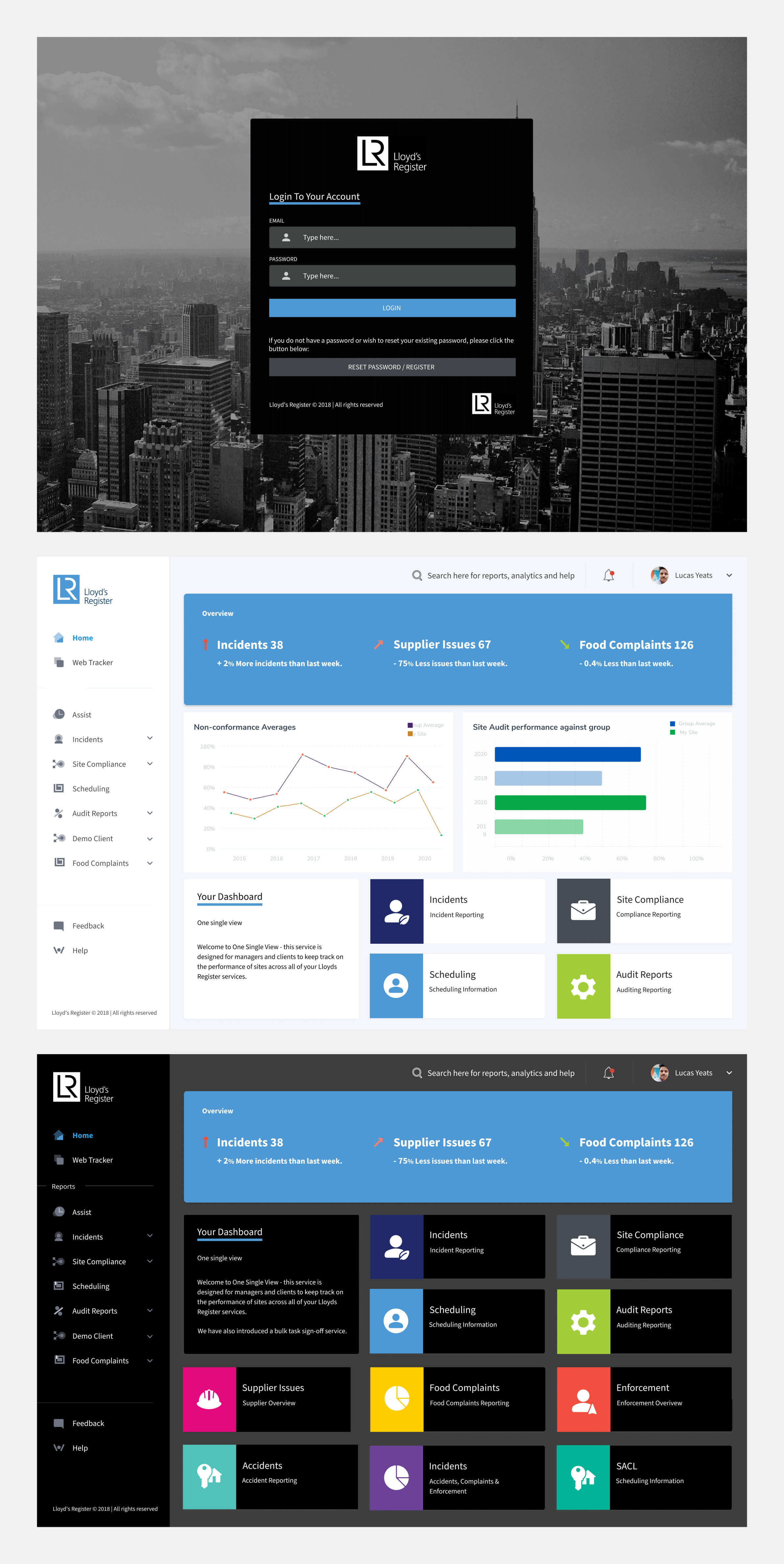
The dashboard prioritised unresolved incidents and issues before supporting metrics. Charts provided context, but they did not compete with the information needed to trigger a response.
A strong visual hierarchy let managers distinguish immediate action, deteriorating performance and routine information without studying every panel.
Keeping navigation consistent across access levels
Customer permissions changed which services and dashboards were available. The navigation therefore needed to scale across access levels while preserving a stable structure and recognisable starting point.
I focused the information architecture on the user’s available tasks rather than exposing the underlying organisational complexity.
Turning brand guidance into product components
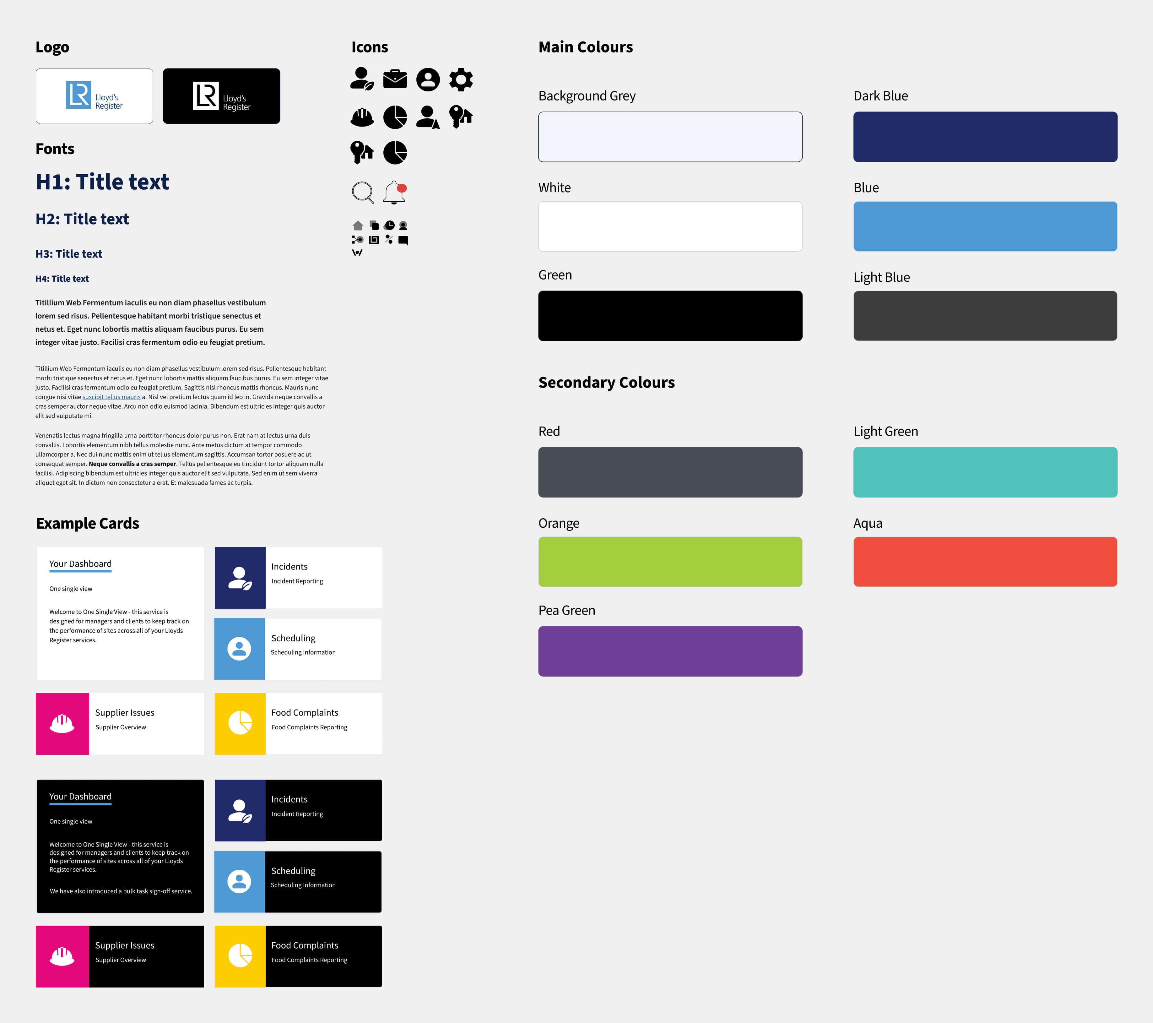
Lloyd’s Register supplied detailed brand guidance. I translated it into practical product patterns rather than treating the dashboard as a one-off branded screen.
The style guide covered the shared visual language needed by the new application and left the development team with a consistent basis for the remaining service pages. A dark alternative was also explored for customers who required it.
The outcome
A dashboard that began with operational priority.
The four-month engagement produced a signed-off dashboard direction, prototypes and a supporting visual system for the newly expanded product suite.
The redesign gave managers a clearer first view of incidents, issues and site performance while accommodating the access rules behind a complex enterprise service.